The last time I wrote anything under the Economics tag, it was a research paper for the Nuclear Engineering department at Michigan, arguing nuclear needs better subsidies to compete with fossil fuels and renewables. That paper leaned entirely on LCOE calculators and IEA spreadsheets. This one’s smaller in scope but scratched a similar itch, I found a table of civilian labor force data from the BLS going back to 2012, and instead of just eyeballing it, I threw it into a pandas.DataFrame and let Python do the arithmetic I’d otherwise get wrong by hand.
The Data
The table covers 2012 through 2025: total civilian population, labor force size, participation rate, employment, unemployment, and how many people are sitting outside the labor force entirely. One footnote worth flagging before touching any of it: the 2025 figures are 11-month averages that exclude October, since data collection didn’t happen that month because of the federal government shutdown. So 2025 isn’t strictly apples-to-apples with the other years, but it’s close enough to be useful.
Here’s the dataset and the first pass of analysis:
import pandas as pd

data = {
    "year": [2012,2013,2014,2015,2016,2017,2018,2019,2020,2021,2022,2023,2024,2025],
    "population": [243284,245679,247947,250801,253538,255079,257791,259175,260329,261445,263973,266942,268571,273653],
    "labor_force": [154975,155389,155922,157130,159187,160320,162075,163539,160742,161204,164287,167116,168106,170807],
    "participation_rate": [63.7,63.2,62.9,62.7,62.8,62.9,62.9,63.1,61.7,61.7,62.2,62.6,62.6,62.4],
    "employed": [142469,143929,146305,148834,151436,153337,155761,157538,147795,152581,158291,161037,161346,163493],
    "unemployed": [12506,11460,9617,8296,7751,6982,6314,6001,12947,8623,5996,6080,6761,7314],
    "unemployment_rate": [8.1,7.4,6.2,5.3,4.9,4.4,3.9,3.7,8.1,5.3,3.6,3.6,4.0,4.3],
    "not_in_labor_force": [88310,90290,92025,93671,94351,94759,95716,95636,99587,100241,99686,99826,100465,102846],
}

df = pd.DataFrame(data).set_index("year")

# Year-over-year change in participation rate
df["participation_change"] = df["participation_rate"].diff()

# Employment growth rate
df["employment_growth_pct"] = df["employed"].pct_change() * 100

# "Not in labor force" as a share of the total population
df["nilf_share"] = df["not_in_labor_force"] / df["population"] * 100

print(df[["participation_rate", "unemployment_rate", "nilf_share"]])
Running that gives you a clean side-by-side of the three numbers that actually matter for this analysis:
      participation_rate  unemployment_rate  nilf_share
year
2012                63.7                8.1   36.299140
2013                63.2                7.4   36.751208
2014                62.9                6.2   37.114787
2015                62.7                5.3   37.348735
2016                62.8                4.9   37.213751
2017                62.9                4.4   37.148883
2018                62.9                3.9   37.129302
2019                63.1                3.7   36.900164
2020                61.7                8.1   38.254286
2021                61.7                5.3   38.341142
2022                62.2                3.6   37.763711
2023                62.6                3.6   37.396138
2024                62.6                4.0   37.407241
2025                62.4                4.3   37.582632
What Jumps Out
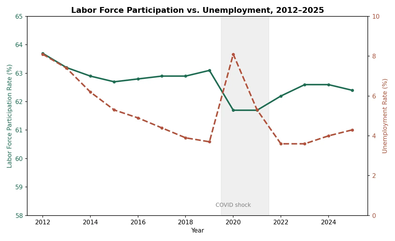
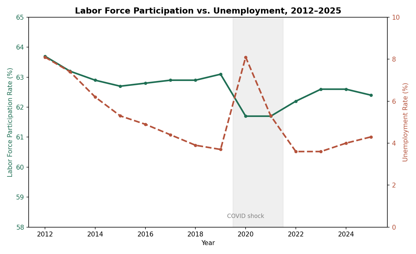
Two lines that are supposed to move together, and don’t, not for the last six years. Data source.
The unemployment rate story is the one everyone already knows: it climbs down steadily from 8.1% in 2012 to a low of 3.6% in 2022-2023, spikes hard back to 8.1% in 2020, and by 2025 has crept back up to 4.3%. That’s a clean V-shape, and it’s the number that gets quoted on the news, so it’s the one I trust the least to tell the whole story.
The participation rate is the more interesting number, and it doesn’t V-shape at all.
covid_drop = df.loc[2020, "participation_rate"] - df.loc[2019, "participation_rate"]
print(f"2019->2020 participation rate drop: {covid_drop:.1f} points")

recovery_gap = df.loc[2019, "participation_rate"] - df.loc[2025, "participation_rate"]
print(f"Pre-covid vs 2025 participation gap: {recovery_gap:.1f} points")
2019->2020 participation rate drop: -1.4 points
Pre-covid vs 2025 participation gap: 0.7 pointsParticipation dropped 1.4 points from 2019 to 2020, which sounds small until you multiply it against a population pushing 260 million. Six years later, in 2025, it still hasn’t closed that gap. It’s sitting 0.7 points below where it was in 2019, even though unemployment on paper looks almost back to normal.
That’s the part that doesn’t get talked about enough. Unemployment measures people actively looking for work and not finding it. It says nothing about the people who just… stopped looking. The not_in_labor_force column is where those people show up, and as a share of the total population it jumped from 36.9% in 2019 to 38.3% in 2021 and has only partially come back down since, sitting at 37.6% in 2025.
So roughly a full percentage point of the population that used to be counted as “in the labor force” one way or another, working or looking, simply isn’t anymore, and hasn’t come back even as the headline unemployment number recovered.
Why This Matters
This is the same lesson I kept running into while writing the nuclear paper: whatever number gets put on the evening news is usually the one that flatters the story being told, and the more useful number is usually one column over.
Unemployment rate is a good number if you want to say “the economy is fine now.” Labor force participation, and specifically how many people have quietly left the labor force altogether, is the number you’d want if you’re trying to figure out if that’s actually true. A country can post a low unemployment rate while permanently carrying more people who’ve dropped out of the workforce entirely, retired early, given up looking, gone on disability, whatever the reason, and the topline number won’t reflect that at all.
None of this is a grand economic theory. It’s just what happens when you load a government table into a dataframe instead of reading the summary paragraph above it.
The Code
If you want to mess with the dataset yourself, the whole script is above, pandas is the only dependency. Swap in your own years or add more columns from the BLS release and the same .diff() / .pct_change() pattern will get you most of the way to a real analysis without touching a spreadsheet.
Data source: U.S. Bureau of Labor Statistics, Employment status of the civilian noninstitutional population, 1955 to date (Table 1, CPS Annual Averages, 2025). Note that 2025 figures are 11-month averages excluding October due to the federal government shutdown.
Interested in the nuclear energy paper referenced above? Read it here.
Questions or corrections? Email me at nickstambaugh@proton.me